Editable/dynamic template style system
Hello everyone,
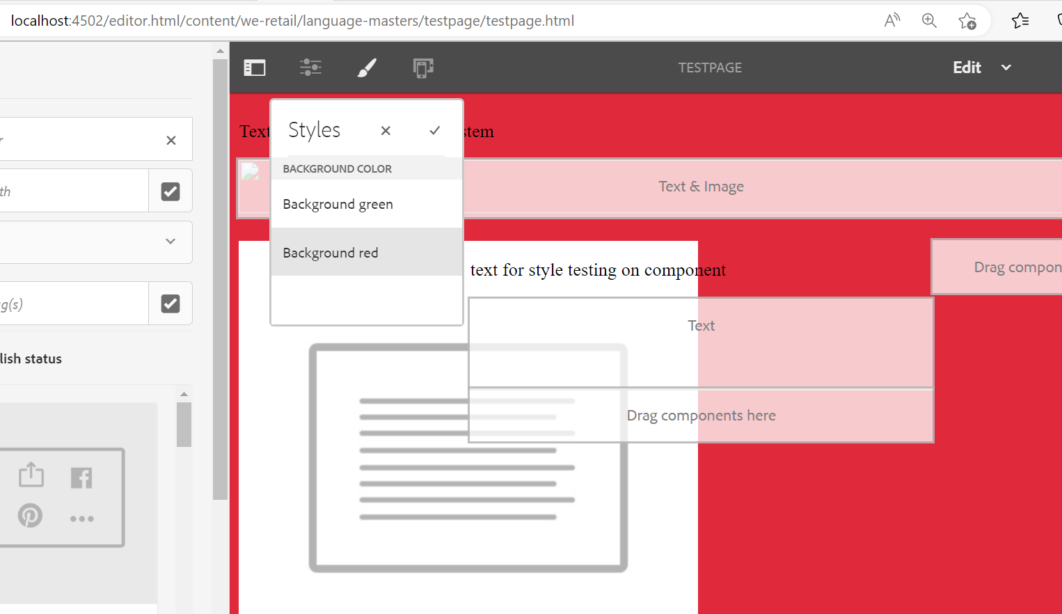
In this post we will see style system for editable template. Basically a template-author can select css style from available style on page/component once the css is present in the client library. developer write the css and keep it in client library now template-author can use the style as per their requirement. Template-author can decide and achieve any style from available styles they want to apply on page. Template-author and developer can define the behavior of the component or page.
Before proceeding please go though the editable template blog Editable template (rjaem.blogspot.com)
we have 2 types of style system.
Page level style system
Component level style system
Page level style system: this style will get apply on body tag of the page. for example, we add the any font color, font family or font size on page level style system it will get applied on the template body so it will apply on the all the fonts available on the page. We should use page level policy for background image or background color like css where we need to have a common css styling all over the page.
follow below steps apply Page policy on template
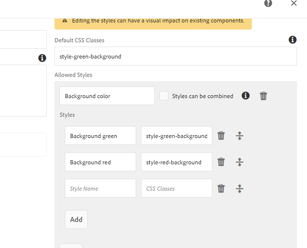
Go template Structure mode--> Page Information-->Page policy --> Styles tab--> Allowed Style : Enter the below details in this section.
we can have multiple styles under one page policy for that we have to give add allowed style in policy for the style we want to add.
Component level Style system: This style will get apply on the particular component where we have added the policy.


Comments
Post a Comment